Screenshots from arch/stumpwm/tmux/vim/qutebrowser setup
I recently made a number of pretty significant change to the look and feel of my Linux desktop environment, and I'm pretty happy with how my setup looks now. It's not for everyone, but I thought at least some of y'all might be interested in seeing how it looks.
What I changed
I was previously using dwm as my display manager—and, if you haven't tried it, I highly recommend it. But I just switched to stumpwm, which sacrifices a bit in minimalism but makes up for it in configurability. That change deserves—and will get—it's own blog post. But, for now, you'll just get to see the pictures.
At the same time, I've changed from a standard Solarized color scheme for vim to the nofrils color scheme as part of an experiment with removing (almost) all syntax highlight from my code. That also deserves its own post; again, all you get right now is the screenshots.
The result of all of these changes is a highly minimalist, distraction-free, and keyboard-centric window setup—and I'm very happy with it for now.
Screenshots
(In each case, click for a bigger image—and most of these really need it.)
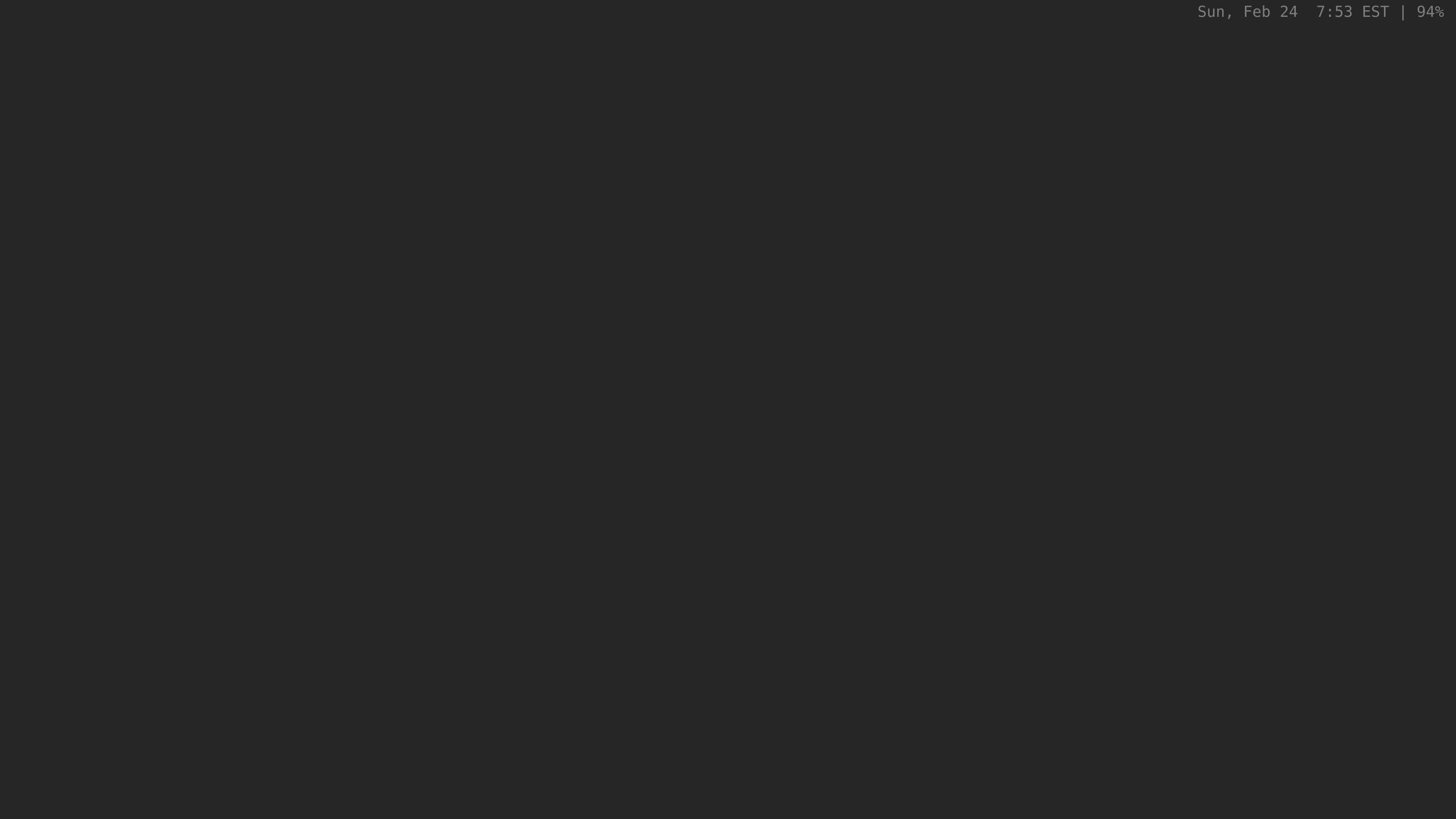
My main desktop, when I log in:
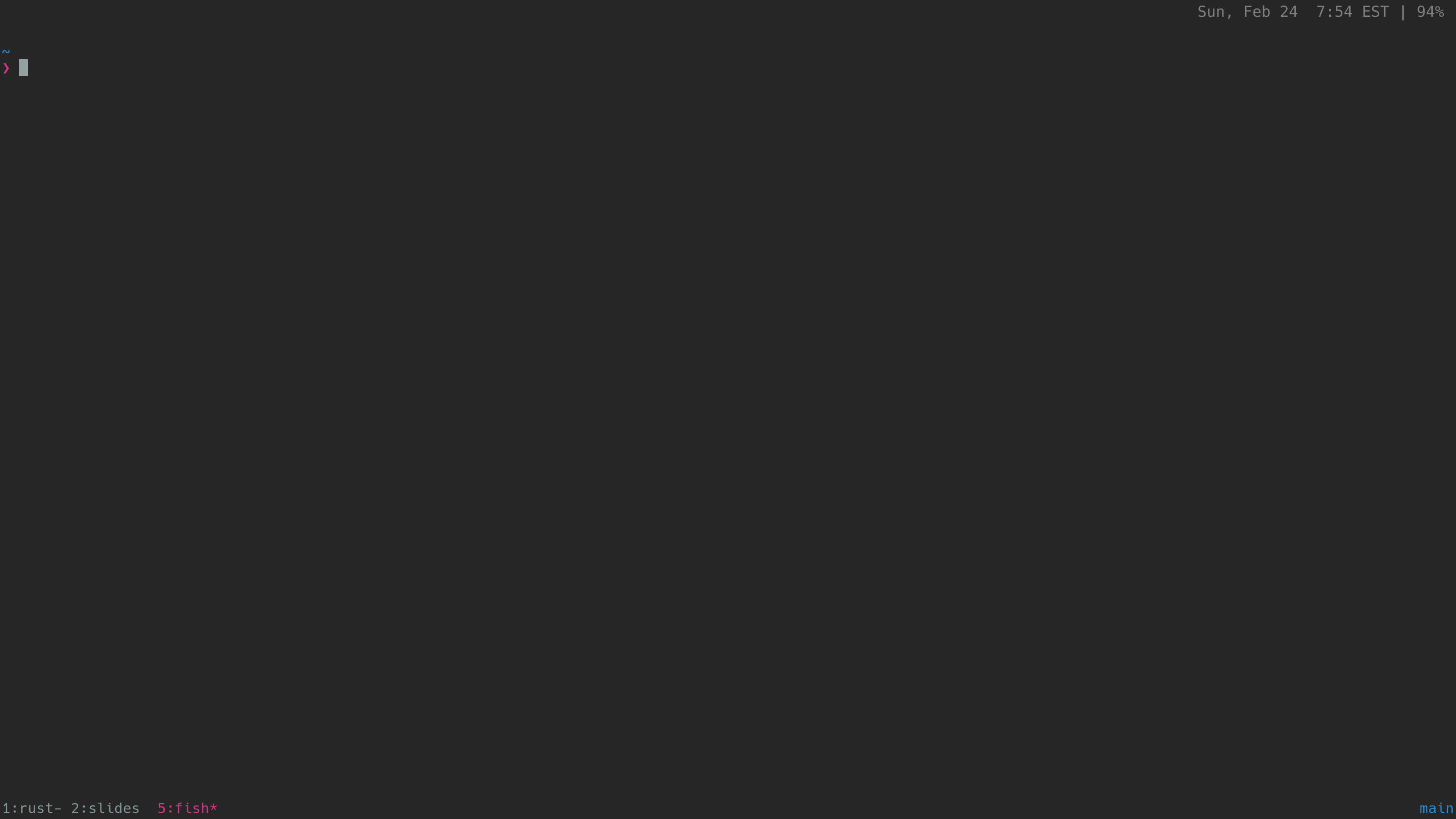
A full-screen terminal session open:
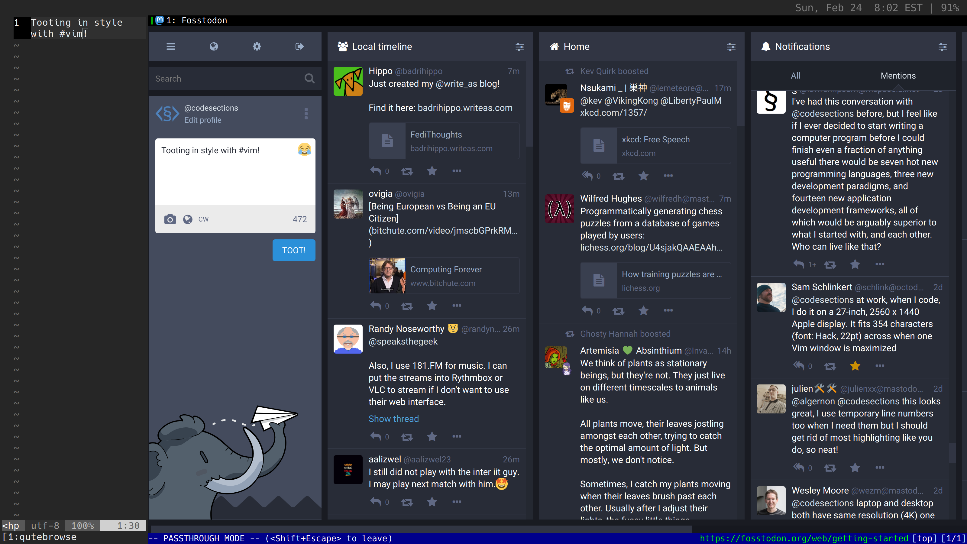
If I'm relaxing, I might be sending toots from fosstodon—and this setup lets me do this right from vim.
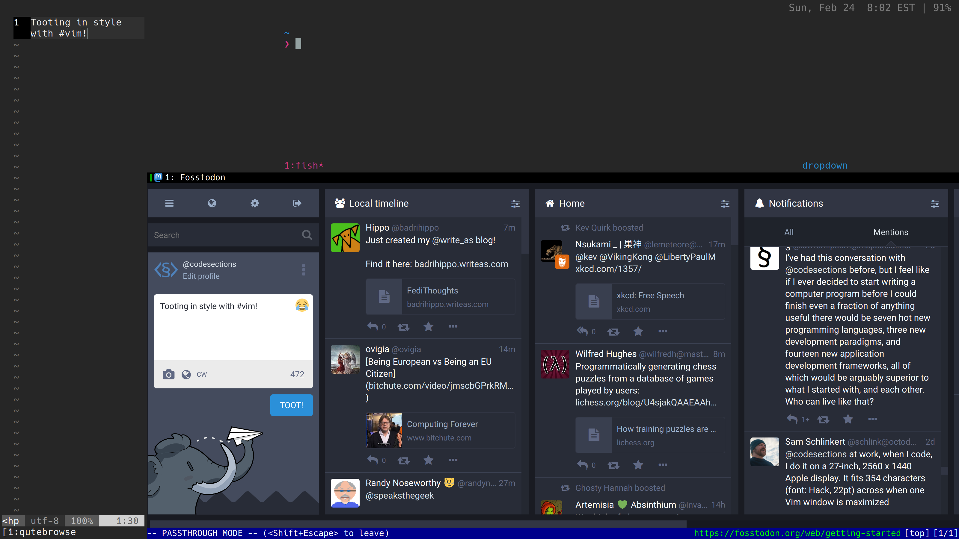
Of course, I'm never more than a key press away from a terminal—including a drop-down terminal if that breaks the workflow less
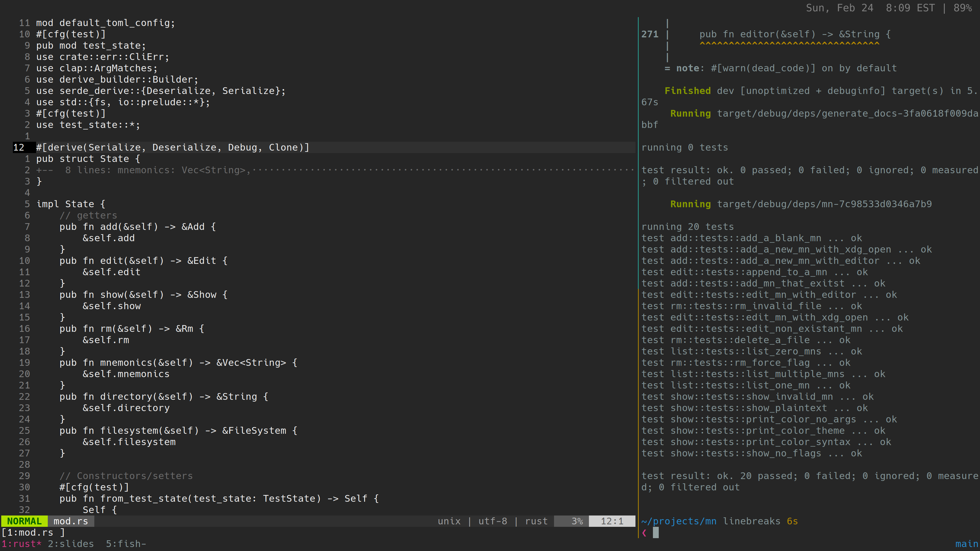
Enough relaxing—time to get some real work done:
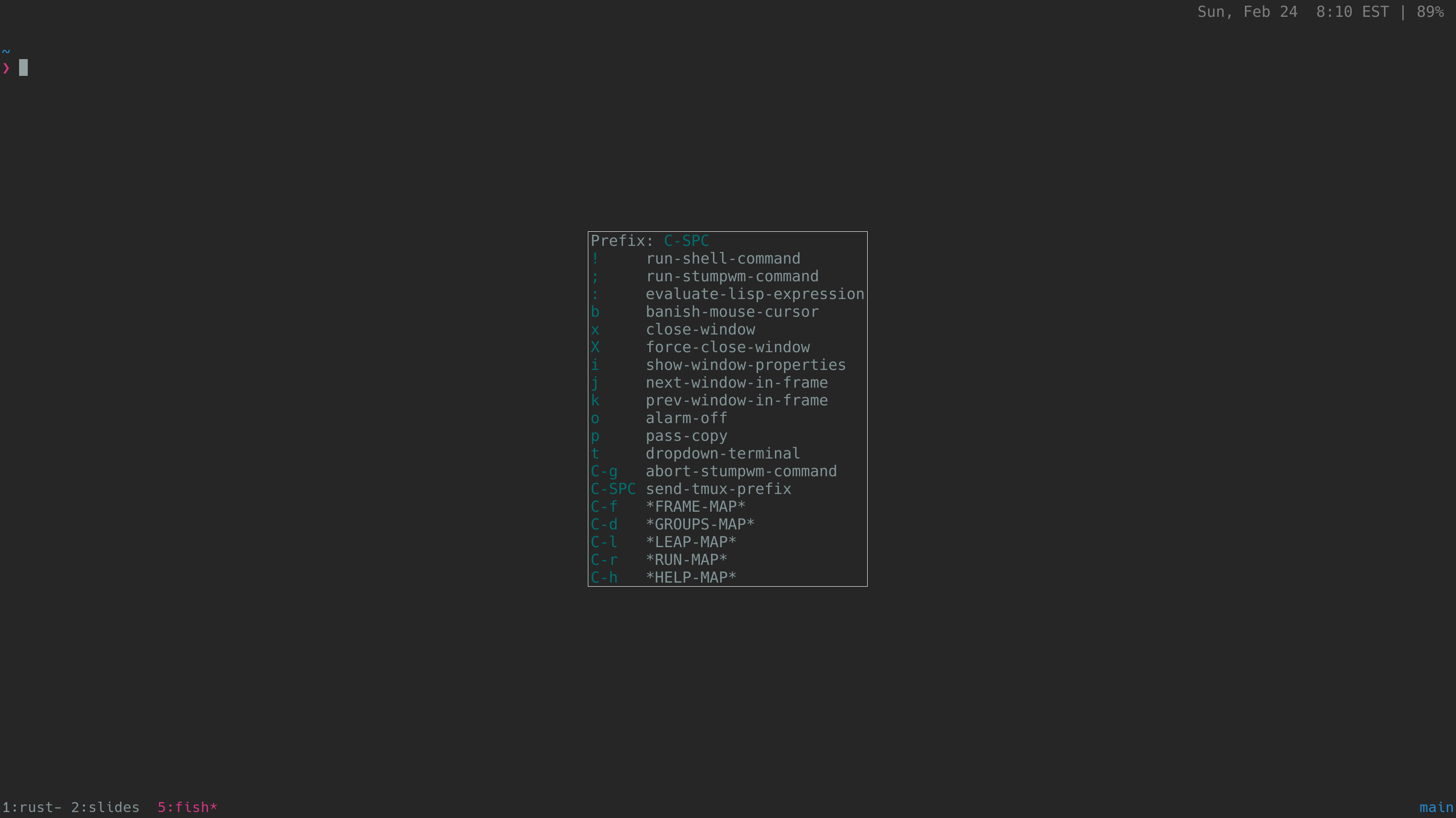
And, if I ever need a reminder about the keys I've set up, stumpwm's built-in help is always there for me.
