This Website
The website you're reading right now! I tried to do things a bit differently with this website.
In building this website, I had three main goals. I wanted the site to:
- have understandable source code,
- be self-sufficient, and
- be the fastest site in the world.
Here is my analysis of how well I managed to meet these goals.
Understandable Source Code
Why do I want to write a page with understandable source code? To answer that, I want to first talk about Richard Feynman and transistor radios.
The Nobel-prize-winning physicist Richard Feynman wrote about his early childhood experience repairing transistor radios in the 1930s. In case you haven't seen a transistor radio, they look like this:
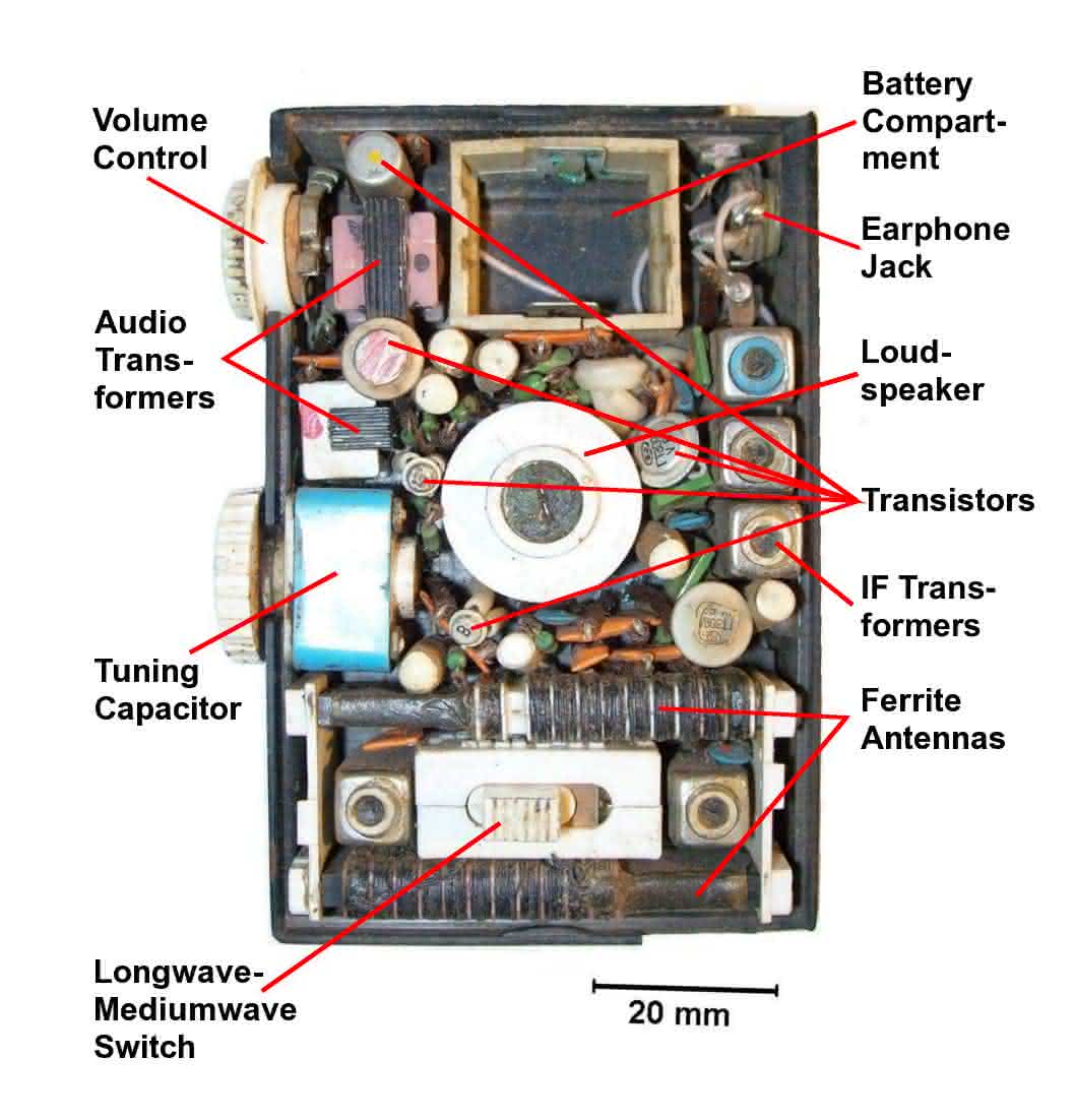
By contrast, a modern radio receiver is so small that millions of people had one inside their cellphones and didn't even realize it.
Why am I talking about radios on a page about this website? Because Feynman was able to learn and apply basic physics in a way that children today basically can't. Radios have gotten too miniaturized, have had their complexity hidden away where no one can learn from it. And I see the same thing happening with websites
Here's a (slightly modified) copy of the markup from the beginning of an extremely early website:
<head>
  <title>The World Wide Web project</title>
</head>

<body>
  <h1>World Wide Web</h1>

  <p>The WorldWideWeb (W3) is a wide-area
  <a name=0 href=“WhatIs.html”>hypermedia</a>
  information retrieval initiative aiming to
  give universal access to a large universe
  of documents.
  </p>

  <p>Everything there is online about W3 is
  linked directly or indirectly to this document,
  including an <a href=“Summary.html”>executive
  summary</a> of the project.
  </p>
Even if you've never read a word of markup before in your life, you can probably just about figure out what that does—that it creates a header (with a title for the page) and then creates a body of the document that consists of several paragraphs with some text and a few links to other html pages.
In contrast to that, consider this excerpt from the markup for a modern news article about that early site. The markup starts like this:
<!DOCTYPE html>
<html lang="en" xmlns="http://www.w3.org/1999/xhtml" xml:lang="en"
      lang="en" xmlns:fb="http://www.facebook.com/2008/fbml" >
<head>
  <meta http-equiv="X-UA-Compatible" content="IE=edge" />
  <meta http-equiv="content-type" content="text/html;charset=utf-8" />
  <script type="text/javascript">
(window.NREUM||(NREUM={})).loader_config={
  xpid:"UQ8EUVRACQAFVVdbAQk="
};
window.NREUM||(NREUM={})
,__nr_require=function(t,n,e){
  function r(e){if(!n[e]){var o=n[e]={exports:
    {}};t[e][0].call(o.exports,function(n){
      var o=t[e][1][n];return r(o||n)},o,o.exports)
    }return n[e].exports}if("function"==typeof __nr_require)
    return __nr_require;for(var o=0;o<e.length;o++)r(e[o]);
    return r}
That is, with JavaScript that has been inlined an minified to the point of being gibberish, even to experienced programmers. Even if we give the article the benefit of skipping past 502 lines (!) of inline JavaScript, we get to this:
<nav class="l-nav l-nav-centered" data-nav data-e2e-name="l-nav"
data-track-page-area="Navigation">
  <section class="container">
    <ul class="row verticals list-unstyled">
      <li class="verticals-flex-grow verticals-listitem"
      data-vertical-label="tech">
          <a href="/sai" class="verticals-listitem-link"
          data-e2e-name="vertical-listitem-link" data-vertical-listitem="Tech">
            <span class="verticals-listitem-label">Tech</span>
          </a>
      </li>

      <li class="verticals-flex-grow verticals-listitem"
      data-vertical-label="finance">
        <a href="/clusterstock" class="verticals-listitem-link"
        data-e2e-name="vertical-listitem-link" data-vertical-listitem="Finance">
          <span class="verticals-listitem-label">Finance</span>
        </a>
      </li>

      <li class="verticals-flex-grow verticals-listitem"
      data-vertical-label="politics">
        <a href="/politics" class="verticals-listitem-link"
        data-e2e-name="vertical-listitem-link" data-vertical-listitem="Politics">
          <span class="verticals-listitem-label">Politics</span>
        </a>
      </li>
All that is to say that html and CSS markup, at their best, can be like the transistor radio. They can be a toy that anyone motivated and curious enough can pull apart and see how it works. For so many of today's programmers, who grew up with (or before) the Internet, that's exactly what html was.
But I worry that today's html is much more like the tiny, miniaturized radio inside a cell phone—a marvel of engineering, perhaps, but so complex that it (seems to be) outside the realm of understanding for any non-expert.
So, with this website, I'm pushing back against that trend. I've built a highly performant, modern website—but one with markup that is just as understandable as the websites from 1991. Like the radios that Feynman repaired, this is a website that anyone can take apart to see how it works.
To that end, I've left in the comments and have not minified any of the source. This bloats the page a bit, because those comments get sent to your computer even if you don't read them. Nevertheless, I've kept the page tiny and fast—the total page weight is still under 14kb, which means it loads in a single http request.
Below, I have an annotated copy of the markup from the home page. Anytime I do something non-standard or that is debatable, I'll provide a comment explaining why I made the choice I did and what I'm trying to achieve. If you disagree with any of my choices, feel free to let me know via email, twitter, or any of the contact methods in the site footer. I'd love to discuss it with you.
<html>
<head>
  <meta charset="UTF-8">
  <meta name="viewport" content="width=device-width">

  <link rel="apple-touch-icon"
        sizes="180x180"
        href="/apple-touch-icon.png">
  <link rel="icon"
        type="image/png"
        sizes="16x16"
        href="/favicon-16x16.png">
  <link rel="manifest"
        href="/manifest.json">
  <link rel="mask-icon"
        href="/safari-pinned-tab.svg"
        color="#5bbad5">
  <meta name="theme-color"
        content="#d9d9d9">
<style>
/*==================================*\
  ##All CSS for this page
\*==================================*/

/*  Theme colors:
 *
 *  #fd0     yellow (menu bar [old])
 *  #cde     pastel blue (note boxes)
 *  #000     true black (site header)
 *  #4F82BB; Dark Blue  (Nav bar)
 *  #223     near black (text & logo)
 *  #fff     white (menu text)
 *  #07e     sky blue (links)
 */
/*==================================*\
  ##Global
\*==================================*/
html {
  font-family: -apple-system,
               BlinkMacSystemFont,
               'Segoe UI',
               Roboto,
               'Helvetica Neue',
               Arial, sans-serif;
  color: #223; /*near black*/
}

/*==================================*\
  ##Nav bar
\*==================================*/
.nav-bar {
  position: fixed;
  z-index: 1;
  left: 0;
  width: 100%;
  padding: 0;
  background-color: #4F82BB; /*Dark Blue*/
  box-shadow: 0 3px 6px rgba(0, 0, 0, .3);
}

.nav-bar--top {
  top: 0;
}

.nav-bar__container {
  display: flex;
  max-width: 700; /*max comfortable line length*/
  padding-left: 8px;
  padding-right:8px;
  margin: auto;
  justify-content: space-between;
}

.nav-bar__button {
  position: relative;
  /*  This isn't needed for display of this element,
   *  but important for the :after pseudo element
   *  below. */
  cursor: pointer;
  background-color: inherit;
  height: 1.25em;
}

.nav-bar__button:not(.nav-bar__button--current-page) {
  color: white;
}

.nav-bar__link {
  color: inherit;
  text-decoration: none;
}

.nav-bar__link::selection {
  background-color: inherit;
  color: inherit;
}

.nav-bar__link:after {
  position: absolute;
  bottom: 0;
  left: 0;
  width: 0;
  height: 0;
  content: "";
  transition: all 0.4s ease;
  border-top: 3px solid #223; /*near black*/
}

.nav-bar__button:not(.nav-bar__button--current-page)
  .nav-bar__link:hover:after {
    width: 100%;
}

.svg__logo {
  height: 40px;
  width: 40px;
}

@media (max-width: 599px) { /*Phone only*/
  .nav-bar__button {
    font-size: 1.382em;
    line-height: 1.382em;
    /*  The goal is creating a larger target for
     *  touch navigation while also shrinking
     *  the amount of horizontal space devoted to
     *  the menu.*/
  }
}

@media (min-width: 600px) {  /*Tablet-portrait & up*/
  .nav-bar__button {
    font-size: 2em;
  }
  .svg__logo {
    height: 64px;
    width: 64px;
  }
}

/*==================================*\
  ##Main content
\*==================================*/
.content-main{
  margin-top: 2em;
  min-height: calc(100vh - 100px - 2.9em);
  /*  This equals [fullscreen - (top margin) -
   *  (space for the 2-line footer, with margin)]*/
  max-width: 700px; /*  Match nav container width*/
  margin-left: auto;
  margin-right: auto;
  padding: .1em;
  font-size: 1.15em;
  line-height: 1.6em;
  color: #444;
}

article {
  padding: .75em;
  padding-top: 0;
  border-style: solid;
  border-color: #f2f2f2;
  border-radius: 13.3px;
  border-width: 1.5px;
  margin-top: 1em;
  margin-bottom: 1em;
  box-shadow: 1px 1px 25px #f2f2f2;
}

@media (min-width:  600px) { /*Tablet-portrait & up*/
  article {
    margin-top: 2em;
  }
}

.site-header{
  margin-bottom: 0;
  margin-top: 1em;
  text-align: left;
  font-size: 1.618em;
  font-weight: 400;
  line-height: .85;
  color: #000;
}

.content-p {
  color: #223; /*near black*/
  margin-top: 1em;
  margin-bottom: 0;
}

.link,
a {
  color: #07e; /*sky blue*/
  text-decoration: none;
}

.note {
  background-color: #cde; /* Pastel blue*/
  display: block;
  padding: .5em;
  margin-top: 1em;
  color: #0d1d25; /*near black*/
  border: solid 2px #0d1d25; /* Near black*/
}

p code,
ul code {
  padding: 2px 4px;
  color: #c0341d;
  background-color: #fbe5e1;
  border-radius: 3px;
}

pre {
  overflow: scroll;
}

img {
  width: 100%;
}

.highlight {
  overflow: auto;
}

.header__blog {
  margin: auto;
  width: 175px;
  width: fit-content;
  position: relative;
  margin-top: -5px;
  margin-bottom: -15px;
}
@media (min-width:  600px) { /*Tablet-portrait & up*/
  header__blog {
    margin-right: calc(50% - 55px);
  }
}

.blog-title {
  position: absolute;
  display: inline;
  top: 54px;
}

.blog-title--left {
  right: 180px;
  display: none;
}

.blog-title--right {
  left: 180px;
  display: none;
}
@media (min-width:  600px) { /*Tablet-portrait & up*/
  .blog-title--right,
  .blog-title--left {
    display: inline;
  }
}

.pagination-nav {
  display: flex;
  justify-content: space-around;
}

@media (min-width:  600px) { /*Tablet-portrait & up*/
  .site-header {
    font-size:  2.618em;
    padding-top: 4vh;
    padding-bottom: 1vh;
  }
}

/*==================================*\
  ##Footer
\*==================================*/
.footer {
  margin-top: 1em;
  text-align: center;
}

</style>
</head>
<body>
<nav class="nav-bar nav-bar--top">
  <div class="nav-bar__container">
    <div class="nav-bar__button"><a class="nav-bar__link" href="/">Home</a></div>
    <div class="nav-bar__button"><a class="nav-bar__link" href="/about">About</a></div>
    <div class="nav-bar__button">
      <a href="/">
        <!-- The code for the site logo, which is an inline SVG because that loads faster-->
        <svg class="svg__logo" viewBox="0 60 700 700" >
          <circle r="412.74" fill="#4F82bb" cy="250" cx="350"></circle>
          <path d="M 291,128 C 259,154 252,196 268,229 c 11,20
          32,29 40,37 -36,16 -57,44 -59,85 -1,64 56,91 99,111 39,11
          56,62 29,96 -8,12 -52,18 -60,-4 -21,-76 -86,-28 -40,24 37,20
          82,23 120,-1 19,-14 39,-47 36,-81 -5,-34 -21,-44 -49,-66 61,-32
          74,-124 21,-155 C 364,249 307,232 300,196 290,145 325,132 357,132
          c 29,1 33,31 41,45 31,28 39,-12 34,-27 C 415,98 327,104 291,128 Z
          m 69,292 C 268,381 271,320 331,279 c 100,9 81,111 30,141 z M 0,347
          C 42,395 168,539 207,581 c 0,-33 0,-57 0,-94 -41,-46 -85,-96
          -123,-139 37,-49 85,-98 123,-143 0,-16 -0,-81 -1,-93 C 136,195
          71,271 0,347 Z M 487,111 c -0,32 -0,56 -1.7e-4,90 38,45 96,111
          123,143 C 568,396 526,446 487,490 c 0,10 1,82 1,90 C 544,518
          633,420 696,345 645,287 534,164 487,111 Z" />
        </svg>
      </a>
    </div>
    <div class="nav-bar__button"><a class="nav-bar__link" href="/blog">Blog</a></div>
    <div class="nav-bar__button"><a class="nav-bar__link" href="/projects">Projects</a></div>
  </div>
</nav>

<section class="content-main">

  <h1 class="site-header"> I’m Daniel Sockwell, a
  web developer who started coding in an odd way:
  I was a lawyer in New York, when my firm needed
  a coding lawyer.</h1>

  <p class="content-p">Lawyers and programmers are
  both incredibly logical, but somehow they don't
  always speak the same language.  My goal is to
  bridge that gap, by being skilled in both
  domains—and the first step in doing that is
  leveling up my programming skills.</p>

  <p class="content-p">As part of that process,
  I've built this site to provide a home for the
  <a class="link" href="/projects">projects</a>
  I'll build along the way—and to take the
  opportunity to build a
  <a href="/projects/codesections-website/"
  class="link">website that is like Richard
  Feynman’s radios</a>.</p>

</section>

<footer class="footer">
  <div class="footer_copyright">
    © 2018 |
    <a href="https://www.codesections.com/blog/index.xml" type="application/rss+xml">
    RSS </a> |
    <a class="link" href="/license/">  Some Rights Reserved</a>
  </div>
  <div class="footer_contact">
    <a class="link" href="https://gitlab.com/codesections">GitLab</a> |
    <a class="link" href="https://github.com/dsock">GitHub</a> |
    <a class="link" href="https://www.linkedin.com/in/daniel-sockwell/">LinkedIn</a> |
    <a class="link" href="https://fosstodon.org/@codesections">Mastodon</a> |
    <a class="link" href="mailto:daniel-public-email@codesections.com">Email</a>
  </div>
</footer>
<script src="/livereload.js?port=1112&mindelay=10"></script></body>
</html>
    Prevents phones from "zooming out"
    to display a window/viewport into
    the page.  This behavior is helpful
    for sites that are not optimized
    for mobile presentation, but isn't
    helpful for this site because it
    contains mobile-specific css styles


    These next several lines link to
    various favicon icons (the little
    icon that shows up in your tab on
    most modern browsers.  Many sites
    just link to 1 favicon, but that
    results in either sending much too
    large of an icon to all browsers
    (reducing page speed) on in sending
    an icon that isn't optimized the
    the relevant browser.  This code
    instead sends just the correct icon
    for each browser.  See
    [realfavicongenerator.net](https://realfavicongenerator.net/)
    (which is also the site I used to
    generate these icons) for more
    details.


    This is the CSS style for the site.
    A few notes:

    First, some people would consider
    it poor practice to inline all the CSS
    as I have instead of linking to an external
    file with the css. Linking to an external
    file has several advantages that make it
    much more widely used:
- It is more maintainable. Different pages on the site can all link to the same css file, which means that changing formatting for a particular element only requires changing the single css file. In contrast, if I want to change, say, the color of the navigation bar, then I have to change that piece of css in all my files.
- It is typically faster for repeat visitors (or people who visit the site more than once). Once someone has downloaded the css for the first time, the css file will be cached locally, and they won't need to request it from the server. This means that subsequent requests will be able to load the local resource, which is faster.
- It allows resources to be downloaded in parallel. Modern browsers can download multiple files at the same time, which means that the browser can download something else while it is downloading the first css file (such as an image or other css file). In contrast, with inline css, the browser won't start downloading any resources until it has fully downloaded and parsed the html file.
Self-Sufficient Website
[Coming soon]
Fast
[Coming soon]